Tuesday, November 5, 2013

#FREEART


I'll never stop drawing. You'll see me doodling away and find my colourful characters decorating concert and event posters and the poles and boards littered all over our city. I've always been enamoured with my drawing style. I love that I draw like I'm 7. That will never change. I loved creating all of those characters that adorned all of the cards and magnets and prints and stickers that I'd sell. Well, I've been carrying some of that stuff around with me for years now and with my decision to focus on creating affordable original pieces of art I thought it would be neat to give a bunch of my art away. I will be doing this exclusively through twitter. So, if you want to get in on the action your best bet is to follow me at @MinusIndustries.

There will be two ways to get something;

[1] Shoot me an email with the subject line "I WANT ART!" Be sure to include your name and mailing address and I'll send you one of my homemade magnets inside one of my cards. The card will be blank so now you'll have a decision to make, you can either keep 'em or gift 'em. It's up to you! 

[2] I'll be dropping a bunch of magnets and tiny original stencilled works of art around the city! I'll be tweeting the times and places once this starts. Let the fun begin!

Looking Ahead...

It's funny how looking ahead usually involves taking a step back. I've immersed myself in my art for so long that it is only now that I am starting to figure out where I want to be. I love working with spray paint and stencils. I find the medium so unforgiving, tedious, surprising and rewarding. There is no other way I would rather express myself. So, I'm going to focus on that. Spray painting and stencilling original works of art. I'm excited to start editioning my work and make it more affordable. I truly believe that art should be accessible to all. I have some new imagery that I'm going to start developing and am very excited to start creating and compiling a new arsenal of stencils. I like this blog but I find it hard to commit to sitting down and doing it. I'd much rather be creating art. So, I'm going to keep this blog as an archive and will post from time to time but the best place to keep up to date on what I'm up to is twitter. I'll continue to try and post as regularly as I can. So, if you're not following me already you can find me over here! That's where I'll be...

2013 Tour of Alberta

It seems fitting that this was the inaugural year for the Tour of Alberta because it was a first for me in a lot of ways too. This was an opportunity that I just couldn't refuse. Although I had never done anything like this before I was intrigued by the challenge. The organizers approached me with the idea of creating and selling my art in a festival setting. Even though I was unsure of the idea I still committed right away. Seeing as I only had a month to prepare there wasn't any time to go through my usual phase of doubting and second guessing myself. I had to get to work right away. I knew that I wanted all of the imagery to cater to the event. I began with brainstorming ideas and bike related imagery. I started sourcing different materials and began creating stencils. In a very short period of time I created and cut an arsenal of biking related stencils. The main stencil is a pack of riders really pushing hard towards the finish line. I also did some complementary stencils of bicycle gears, bike tire treads and wheel spokes. To tie the overall image together I also used a few text based stencils. I cut out a stencil mapping the tour across the province and through another stencil I told a "story" of a bike race using a glossary of common cycling terms such as pace line, attack and leadout. With the permission of the organizers I was able to make a stencil of the event logo thus making my art pieces official commemoratives of the event. I did all of the painting live over two days at Churchill Square. It was a little bit tricky trying to navigate through the heat and wind but having a tent definitely helped. I built the pieces up using different layers and colours of paint. I worked very fast and spontaneously to give my work the flow and excitement and explosive feeling of the actual race. Doing piece after piece really helped. It was easy to follow through on different ideas that would spring up during the creative process and let them build off of one another. I'm really happy with how the pieces turned out and enjoyed being immersed into the excitement of Edmonton's cycling community. I would definitely do something like this again. It's not easy to set up to spray paint live in an overcrowded festival environment but at the end of the day the paintings really speak for themselves. I think I ended up doing 10-15 pieces over the 8 or so hours spread across the two days. Some of my favourites are below... It was hard to capture pictures of all of them as people were buying them left and right. These were the six that I was able to get photos of. As you can see, while the concept and execution may be the same, no two pieces look alike. One of my favourite parts of using spray paint and stencils is even within a series like this one no two pieces ever look alike. In all the pieces I really tried to push the perspective of the lead racer and show the excitement and movement of him pushing away from the pack.


[1] I really like the colours on this one. I love how the rainbow gradient of the spokes really draws you into the central image. I also love that bright warm blast of yellow behind the red gear, the two elements together really frame the outline of the lead rider.

[2] This is my favourite. I built up the image by layering different tire treads on top of each other. I love how the rest of the riders get lost in this piece and the focus lies on the race leader. I love the vibrant colour and constant juxtaposition of this painting. It actually feels like it's moving, like it's happening right now.

[3] For this piece I used a more pastel colour palette. I love how white space and what's not painted play a pivotal role in this painting. I love the focus on the "story".

[4] There is something about this painting... I'm always going back to it. I love the richness of all of the colours and the build up of the cyclists. This one looks really clean and gives the viewer an opportunity to appreciate the over spray of the paint.

[5] This was the only piece where I focused on one tone and really tried to build up the image out of like and complimentary colours.

[6] I like how the riders seem to be bursting out of the background on this one. It almost looks like they're coming from behind the canvas and are just about to ride through the painting at any given moment.

Snapshots

Snapshots is another series that I did specifically for Make It! I pride myself on selling my original art for a very fair and reasonable price point. I want my work to be accessible to all. So, with that in mind, I made these intimate one colour stencil pieces for the art collector with a smaller budget in mind. These pieces are "Snapshots" or smaller portions of my larger stencilled works. They are a one colour black stencil sprayed on top of a light weight metallic textured paper.


Snapshots [4" x 6"]  Group Shot


Snapshots [5" x 7"] Group Shot


Snapshots [4" x 6"] Detailed Shot From Left to Right
Help!-A Hard Day's Night-Let It Be-David Bowie
Johnny Cash-Houses of the Holy-Sticky Fingers-Who's Next


Snapshots [5" x 7"] Detailed Shot From Left to Right
A Hard Day's Night-Houses of the Holy-Sticky Fingers-RUSH
David Bowie-Kurt Cobain-Jimi Hendrix-Elvis Presley


Snapshots [4" x 6"] Detailed Shot From Left to Right
Snapshots [5" x 7"] Detailed Shot From Left to Right
Tree-The Velvet Underground-Nevermind-Casette
Brad Pitt-Welcome to the Monkey House-James Dean-Tree

Records

I was inspired to start painting on records early last winter. I had the Make It! show coming up and I really wanted to do something special for it, plus thanks to my Rainbow Series I've been using halved album sleeves as canvas's so I had a ton of records literally just laying around. I thought that it would be cool to paint some of my Rainbow Series music based imagery onto these old unwanted reclaimed records. NO! I don't know if they still play! Quite asking me that! *Smile*. All of the records were painted using just one stencil amongst a variety of spray painting and freehanded techniques. These art works are very fluid and gestural. They can be broken down into three distinct series. Albums: Classic Album Covers, People: Famous Musicians and Silver: The images are rendered completely in metallic silver spray paint.


Albums: 1. The Beatles A Hard Day's Night 2. David Bowie Aladdin Sane 3. David Bowie Aladdin Sane 4. Pink Floyd Dark Side of the Moon 5. Led Zeppelin Houses of the Holy 6. Nirvana Nevermind 7. RUSH 8. The Rolling Stones Sticky Fingers 9. The Velvet Underground 10. Madonna True Blue 11. The Dandy Warhols Welcome to the Monkey House 12. The Who Who's Next


People: 1. Johnny Cash 2. Kurt Cobain 3. Jimi Hendrix 4. David Bowie


Silver: 1. Elvis Presley 2. Led Zeppelin Houses of the Holy 3. The Beatles Let It Be 4. Nirvana Nevermind

Make It! 2012


I had a blast doing the Holiday version of Make It! in 2012. It was easily the biggest show to date that I've taken on. Months of planning and a staggering amount of new pieces were undertaken and created. Here are a few images of our set up. It's easily our most professional and concise one to date. I made the MINUS INDUSTRIES sign entirely by hand. It seemed fitting to have a giant stencil represent this body of work. Make It! went really well for us. It was great to get out of the studio (read; my garage) and show and sell my work. With that said, participating in Make It! is a ton of work! That is part of the reason why I won't be participating this year. I've kind of taken a step back and am deciding where I want to be in terms of my art and imagery. I'm looking forward to putting together a new body of work comprised entirely of found materials, stencils and spray paint. You'll see me at both Make It! and Royal Bison somewhere down the road... I PROMISE!

Dogs

This painting marks the second commission that I've done for Dave, both gifts for his wife Melanie. Dave & Melanie are another lovely couple that I've had the pleasure of working with. To date, this is one of the most difficult projects that I've ever attempted. It wouldn't have been possible without everything I learned from painting Don & Paul in a previous commission. Thankfully I was able to complete these two works back to back. They served as a great learning experience and a good jumping off point for one another.


[1] Using stencils, I've laid out my basic blocks of colour. You can see that I've done a little freehanded spray painting (spray painting done without the use of a stencil) to fill in texture and capture definition.

[2] Here I've added my first layer of detail. You can see the definition start to form in the dogs and the grass.

[3] Now I've added the second layer of detail.

[4] Here is the painting with the third layer of detail.


[5] Once I've painted all of the stencils I take a look at the painting and compare it to the original phoptograph. What stands out to me is how vibrant the painting is. It needs to be more subdued. The dogs need to be better blended into the grass and the painting needs to be less static. After all, the original photograph is an action shot of two rambunctious dogs playing. I wanted the painting to capture the emotion and action and movement of that photograph.

[6] In this image you can see that I've started to blend the dogs into their environment. I did this by layering layers upon layers of spray paint through painting freehanded and by re-layering and repainting certain parts of the stencils that I previously sprayed in images 1-4.

[7] [8] In this side by side comparison you can see the final version of the painting next to the original photograph. I'm ecstatic with how everything turned out. These were by far some of the most intricate and time consuming stencils that I've ever cut. I love how photo realistic I was able to get the painting.

Why listen to what I thought about the piece when you can hear it right from Melanie?! Here's the little note she sent after receiving the piece from her husband Dave as a surprise Christmas gift. She had no idea! He even concocted a story for when he picked up the piece at my studio while she waited in the car!

Hi Lon!
I just wanted to thank you so much for the beautiful painting of my lovely, rotten, baby dogs :) I couldn't stop crying Christmas morning. It is absolutely perfect! I took the original picture and you captured the moment (and movement) beautifully. Their eyes are even just as crazy in the painting as they are in real life! The stick game is their favourite game to this day. I couldn't be happier :) I can't believe that you and David managed to top last year's gift...and my dogs are close to the only things that could do it. Thank you, thank you, thank you.
Melanie

Don & Paul

Don & Paul are a very nice couple that I met a few years ago after I had donated a custom spray paint stencil piece to a local silent auction. Basically, I described how I would take their favourite memory [aka photograph] and turn it into an original work of art on canvas. Although they didn't really understand what all that entailed, they liked the idea of owning an original piece of art based on their own memories and experiences. I mean really, who wouldn't want that?! So, they bid and they bid and they bid again until the auction was over and they had won. They were so happy with the final result that they commissioned me to do another one. At first I was really excited and then I remembered that they both sport designer glasses and stylish facial hair... Two things that are very difficult to depict with stencils. The only thing more difficult then rendering glasses or facial hair with cardboard, a knife and spray paint is painting a realistic background based on a landmark. You see, what is cool about Don & Paul is that they love the arts and they love to travel. They truly want to see and experience the whole world. They take great time and pride in choosing the perfect photograph that truly captures them and a very specific moment in time. So, they choose a picture of them in front of the Great Wall of China [GWOC]. When they first brought the project to me they kind of mentioned that would most likely be the picture they would choose. So even before seeing the photo I was scared. Once they emailed the actual photo to me I was really really really scared. I knew that I had to keep the piece as photo realistic as possible. This was a challenge that I'd never faced on this scale before. The scope of the project was so big that I knew that I couldn't take it on all at once. I'd have to split it up. Thanks to Don & Paul, this is why the way that I paint would forever change. They weren't in a rush for the piece - thank goodness - so I literally had months to get it done and so I really took advantage of that time. The overall breadth and scope and detail of the image made me really plan out my approach. I took about a month of studying the image and writing notes and brainstorming techniques before I committed to a Plan of Attack [POA]. I decided that I would divide the image into two parts: Don & Paul and the GWOC. This image really lent itself to that approach as Don & Paul were in the foreground while the GWOC was in the background. I knew that this method of separating the image would lend itself to the most accurate and detailed stencils possible as I could focus on one particular portion of the image rather than the overall image. I like my spray paint and stencil work to be as genuine, pure and authentic as possible. I don't want to have to add hand painted details and fill in lines to complete the piece, I want the viewer to know that they're looking at a work that was done with stencils and spray paint, but at the same time I want the image to be photo realistic. Don & Paul were always curious about my process so I wanted to break it down for them. In fact, I'd always wanted to write a detailed account of my process and now I have the perfect excuse to do so. It's hard to understand what cutting a stencil entails until you've done it yourself or seen someone else do it. I've numbered the steps to correspond with an image. Although the image and subject matter for each project is different my process remains relatively the same with each piece. Obviously, as with anything, the more that you do it the more your process evolves and the better that you get at it. You find better solutions and easier ways to solve problems. You're constantly adapting. However, the basic skills and actions remain in place. They just become refined.
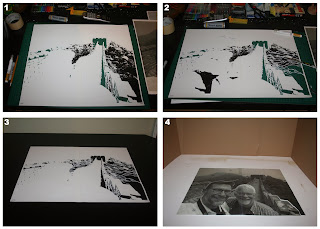


[1] First I decide how many layers I want to do - generally sticking between 4-6 layers. I start by scanning the photo and trying to pull out all of the individual details. I also do lots of hand drawing to turn the image into a stencil. I like my stencils to be as organic and soft as possible and this is difficult when you consider the limitations. I'm literally "drawing" on a piece of heavy weight paper with a knife. I've tried plastic but I find paper more forgiving and more organic and more affordable. For me, it seems more practical. So this image shows me cutting out the stencil of the final detail layer for the background.

[2] This photo shows more of the image being cut away. If you compare the far right side of image 1 with image 2 you can see that I've started to draw into the image to make the stencil. This adds both detail and character to the image while preventing it from falling through.

[3] This is the completed final detail stencil. The white is the cardboard with the black being the area that is cut out. Eventually the cut out area will be meticulously filled in with different layers and colours and shades of spray paint.

[4] This image shows the original photograph. I've blown it up to the size of the canvas (16" x 20"). Here, I am looking at the picture in terms of basic shapes and colours. I'm blocking out the colour for all of the layers to come, basically turning the picture into a puzzle. I cut the image into pieces to make very simple stencils that I'll be able to fill in with colour. If you look closely you can see the image divided into separate pieces that include Don & Paul, the GWOC, the mountains and the sky.
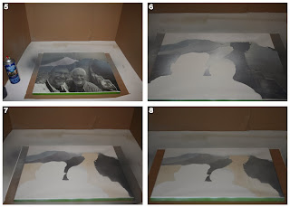


[5] Now I've started to paint the canvas. I've FrogTapped the edges of the canvas. FrogTape gives a nice clean seal and comes off quite easily, like nothing else that I've found on the market thus far. Using spray glue, I've lightly tacked the pieces onto the canvas. A light coating of spray glue keeps the stencil in place without leaving a gluey sticky mess behind. Here, I've started to fill in the mountains whilst being mindful to lay down the paint in a very layered and textural manner. I want the painting to reflect the reality of the image as closely as possible.

[6] Continuing to lay down the blocks of colour one by one by one...

[7] All the initial colour has been applied to the canvas. You can see that even though these are just flat layers of colour, they are anything but... I've paid close attention to details to ensure that these areas of colour are bold and vibrant and account for texture and shade and shadow.

[8] The first layer of detail for the background has been painted. It is very light and just adds a very basic tone and definition to build the image off of.


[9] The second layer of detail for the background has been painted. It is much darker then the first. You can see everything start to come together. In this layer, perspective and detail start to become quite evident.

[10] I've positioned the final background layer on to the canvas and am ready to spray the final layer. Direct contact, correct registration (so all of the layers line up properly) and a light layer of spray glue are all very important when this - and any stencil for that matter - is about to be painted onto any material. In this case, it happens to be a canvas.

[11] Here's the background with the first layer painted.

[12] I've blocked out the silhouette of Don & Paul so that I can do some shading and blending of the entire background.


[13] I've started adding some shading to the background.

[14] This is the finished background. You can see that the foreground is completely blank. If you look around the silhouette, up to the sky and to the bushes and hills to the right, you can see evidence of the shading and blending that I did with spray paint.

[15] With the background now completed, I'm free to move on to Don & Paul. The act of physically separating the painting into two parts will really make Don & Paul stand out and really jump into the foreground. The first layer is just basic colour. I've started off with something really warm so that once I start layering the cooler colours on top of it this bottom layer will really shine through the other layers and warm up the entire piece.

[16] This is the first layer of detail. In this image you can actually see the stencil used. Here, basic shapes and light and dark areas start to form.


[17] Now that the second layer of detail has been added the image really starts to come together.

[18] The final stencil has been added. At this point the piece is basically done.

[19] [20] Here is a side by side comparison of the finished painting and the original photograph. You can really see how all of the different layers come into play to create the painting. I really like how I was able to capture the tone, lighting and perspective of the original photo in my painting.

Looking Back...

YIKES! I can't believe that it's already been over a year since my last post. A lot has happened since then... I've undertaken and finished a ton of projects and have had a bunch of opportunities that are noteworthy. In the next few weeks to come you can look forward to some very detailed blog posts outlining my process and what I was able to accomplish in 365 days. Late last year, I completed two very extensive commissions back to back that would forever change the way that I paint and approach my art. I also had the chance to participate in one of the biggest opportunities that I've ever had... Make It! 2012. There will be some posts describing that adventure, why I'm not participating this year and my goal to return in 2014! For that massive undertaking I developed an entire new line of paintings and produced over 40 original works of art. I'll talk about that process and catalogue the results. That will bring us to this summer where I had the opportunity to do something that I'd never really considered doing... Painting live! The last post, Looking Ahead..., will detail my plans for the future including my recent activity on twitter and hint at a massive attempt to increase my presence in the local art community.

Wednesday, October 3, 2012

Make It!

I am very excited to announce that I'll be at this years Make It! I am so happy to be a part of it! This will definitely be my biggest show to date! This is a great opportunity to see what I've been up to and to start, finnish or continue your Christmas shopping! You can find all the details, and even save a little money, below!

-Lon


______________________________________________

Alberta's independent art, fashion & craft extravaganza is back for 4 days!! Mark your calendar Nov 22, 23, 24 & 25!


Find the best gifts at the largest Make It! ever!

Thursday, November 22 - 4pm to 9pm
Friday, November 23 - 11am to 9pm
Saturday, November 24 - 11am to 7pm
Sunday, November 25 - 11am to 5pm


@ The Enjoy Centre
101 Riel Drive. St.Albert 

Shop for one-of-a-kind handmade items from over 140 of Canada’s hottest urban artisans and designers! [INCLUDING ME!] There will be something for everyone from fashion, accessories, art, jewelry, baby items and home decor!

$5 at the door - $1 off with this flyer: http://makeitproductions.com/edmonton/2012/05/04/2off-admission/

See you there!

______________________________________________

Friday, September 7, 2012

Thursday, February 9, 2012

American Gothic & Easy Rider

It's been a while between posts but I've been busy. That makes it okay right? I'm getting married in May so, I've been hard at work on our wedding invitations...

In between planning a wedding I've still been keeping busy with my art. Well, Frank from SIRENS has been keeping me busy. I've worked with Frank on a few projects now and it's always fun. These last two were for invitations to a couple of the different events that Frank is planning. Blues Music + A Fashion Show = FUN! Frank wanted to do a spoof on two very famous images, American Gothic and Easy Rider. I had a lot of fun with these. Pop culture and parody are a huge part of my work and I've wanted to do my take on American Gothic for years...

I look forward to working with Frank more in the future. Even with the wedding just around the corner I am still available to work on any projects that you may have... The sooner you let me know though, the better... as I see this attitude shifting as the wedding gets closer. So until the big day, you can expect these posts to become fewer and fewer...

Thanks for caring!

-Lon

Tuesday, December 27, 2011

Depeche Mode

Depeche Mode
2011
Spray Paint + Stencils + Collage on Canvas
20" x 20"

This is the commission that I have been working on steadily for the past few months. Dave got me to do it for his fiancee Melanie for Christmas. They are both huge Depeche Mode fans and they were both blown away by the piece, insisting that it's the greatest thing that either of them have ever seen. I guess Melanie spent Christmas morning in absolute awe shaking her head and saying, "I can't believe it... I just can't believe it..." and looking at it over and over and over again.

This is the hardest that I've ever worked on a piece and has more attention to detail than anything that I have ever done. I've never really went too in depth about my process before and this seems like a good place to start. I put a lot of myself into everything I do and am a bit of a perfectionist, therefore I am overly critical of everything that I do. I work hard at my art and am constantly trying to get better and push the spray paint and stencil medium further and further with every piece that I do. Each project is different. It's a new chance to really push myself and develop a style and aesthetic that is all my own. I take commissions very seriously because it is a fan of my work approaching me to do something specifically for them. I love that. This one was different though because it was a gift for Dave's fiancee Melanie for Christmas so I knew going in that it was important that this piece ended up being one of the best things that I've ever done. It did. However, that was quite a bit of pressure that I put upon my self going into this project. As you can tell from the pictures it was worth the effort and everything unfolded beautifully.

I was lucky that Dave approached me about this very early on so I had a lot of time to work on it. That aspect ended up working in my favour beautifully as I was able to take my time with each step and there was plenty of time for drying and contemplating between each stage. When Dave first approached me with the commission he made it very clear that he wanted this to be a very special piece for Melanie. It had to be grown up and it had to be personal--so much more than hanging a poster of your favourite photo of your favourite band on the wall. I told Dave that we could collage some of Melanie's favourite DM memories and artifacts into the piece. Dave really loved that idea. This is where things got a little tricky and I looked to Dave's guidance a lot.

I know of Depeche Mode and their staggering contribution to music and popular culture but by no means am I an expert or aficionado. It would be very different if I were making a Nirvana piece, but even if I was what may be important to me night not be as significant to Dave or more importantly, to Melanie. So I had Dave provide me with all the photos and imagery that I used in the piece and I had him be very specific about what was most important to Melanie and why. Essentially, I knew what needed to be in the foreground and what could go into the background or be left to blend in and add to the overall richness and texture of the piece. Once I had all these "pieces" in front of me I was ready to begin. I knew from taking with Dave that he wanted everything to be based off the classic DM photograph pictured above. We also established that he wanted a bigger show or conversation piece on canvas. So, I ended up working a little larger than I'm used to at 20" x 20". I really liked working large. It seemed to make parts of the process easier.

The next thing I did was cut out all of the stencils. I started with the main image of the guys which ended up being 4 stencils and I finished with the five stencils for the DM logos and imagery imbedded throughout the piece. Then, I sprayed my first 2 layers and did all the collage work in Dave Gahan's jacket. On this piece I did a few things that I haven't done before. The first was that I limited all the collage to Dave Gahan's jacket and used those elements to really illustrate the texture and the highlights and lowlights of his coat. I really let the collaged imagery speak for itself by being nearly untouched and really separated from the rest of the piece. Before I collaged the images I extensively treated them to the point where each individual piece almost became like a piece of fabric rather than a piece of paper. After that was done I finished the stenciling and did some final collaging on top of the piece. I also stenciled the information from the ticket stub of Melanie's favourite show around the entire canvas. This was one of my favourite touches and something I plan to continue in pieces from this point on.

Given the darkness and complexity of the band and their music I really wanted to layer and intertwine the piece at every level. There were at least 15 different stages from beginning to completion in order to complete the piece. Some of the stages were done in a few days while others took up to a week. I really starting experimenting with light and dark, highlights and lowlights, transparencies, and perspectives. As can be seen in the pictures above and attested to by Melanie, no two vantage points are alike. The way the piece is displayed and lit will change what the viewer sees. I tried my best to photograph and capture all the subtleties and hidden layers of the piece.

I could talk about this piece forever because I know what it means to me and my growth as an artist. I can see my career direction solidify and my defining style beginning to be fully realised. It's exciting. I consider this to be my best work to date and I realise that this brief description of the process cannot do this piece justice. Nor is it meant to. It's meant to give a insight into my work. This artwork can definitely speak for itself. I was honoured to work on this for Dave for Melanie for Christmas and I am glad that they possibly love it more than I do.

I know that there are pieces that can define an artists career and I know that this is one of my mine. A definite turning point. I'm excited to see where this road goes...

-Lon